01
Brand Strategy
Defined the identity direction around confidence, growth, elegance, athleticism, and women-centered strength.

A performance identity for Lauren Fisher’s GrownStrong: logo creation, brand system, merchandise, online presence, and athlete-facing applications built to hold up on Nike product, social content, training equipment, and the gym floor.
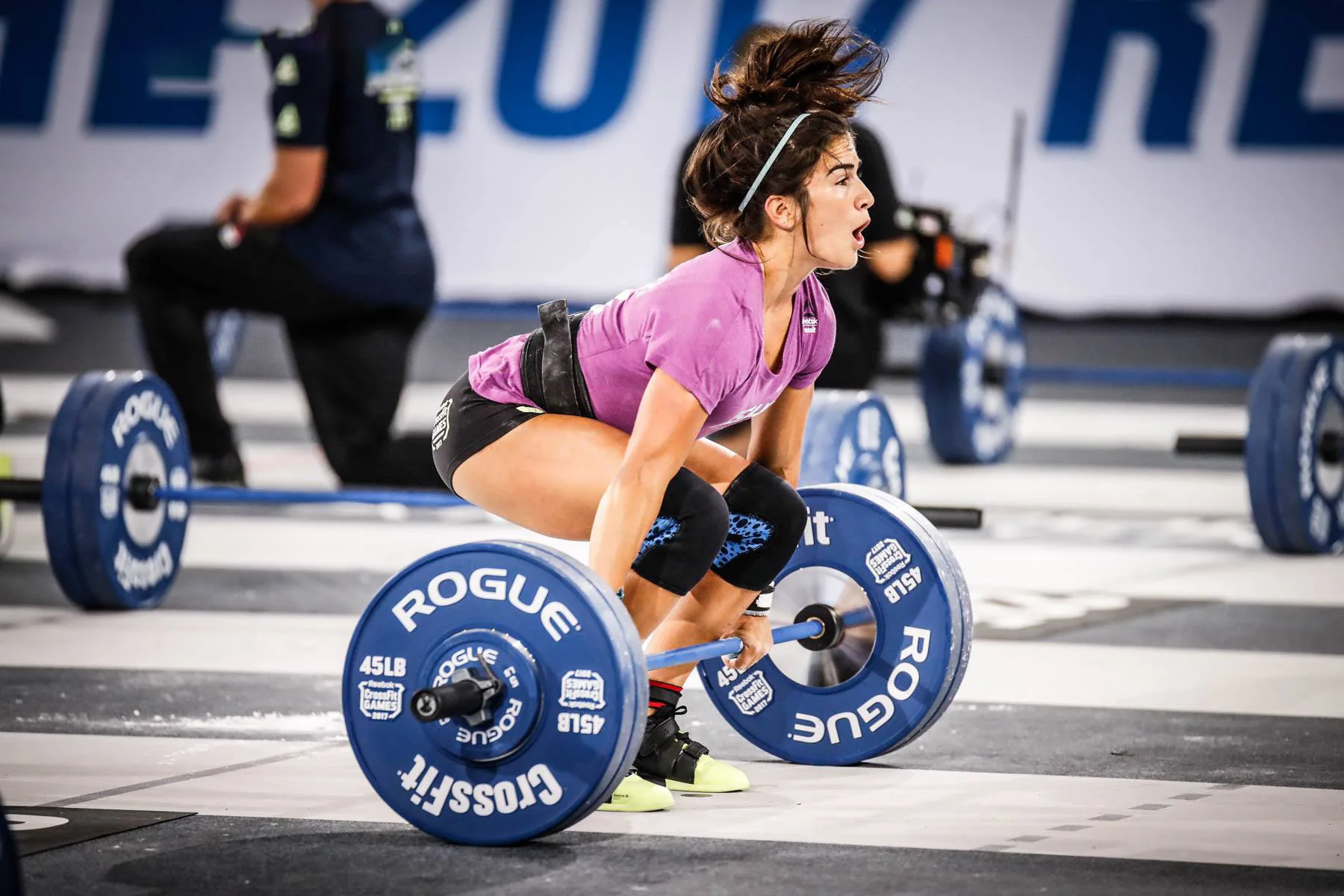
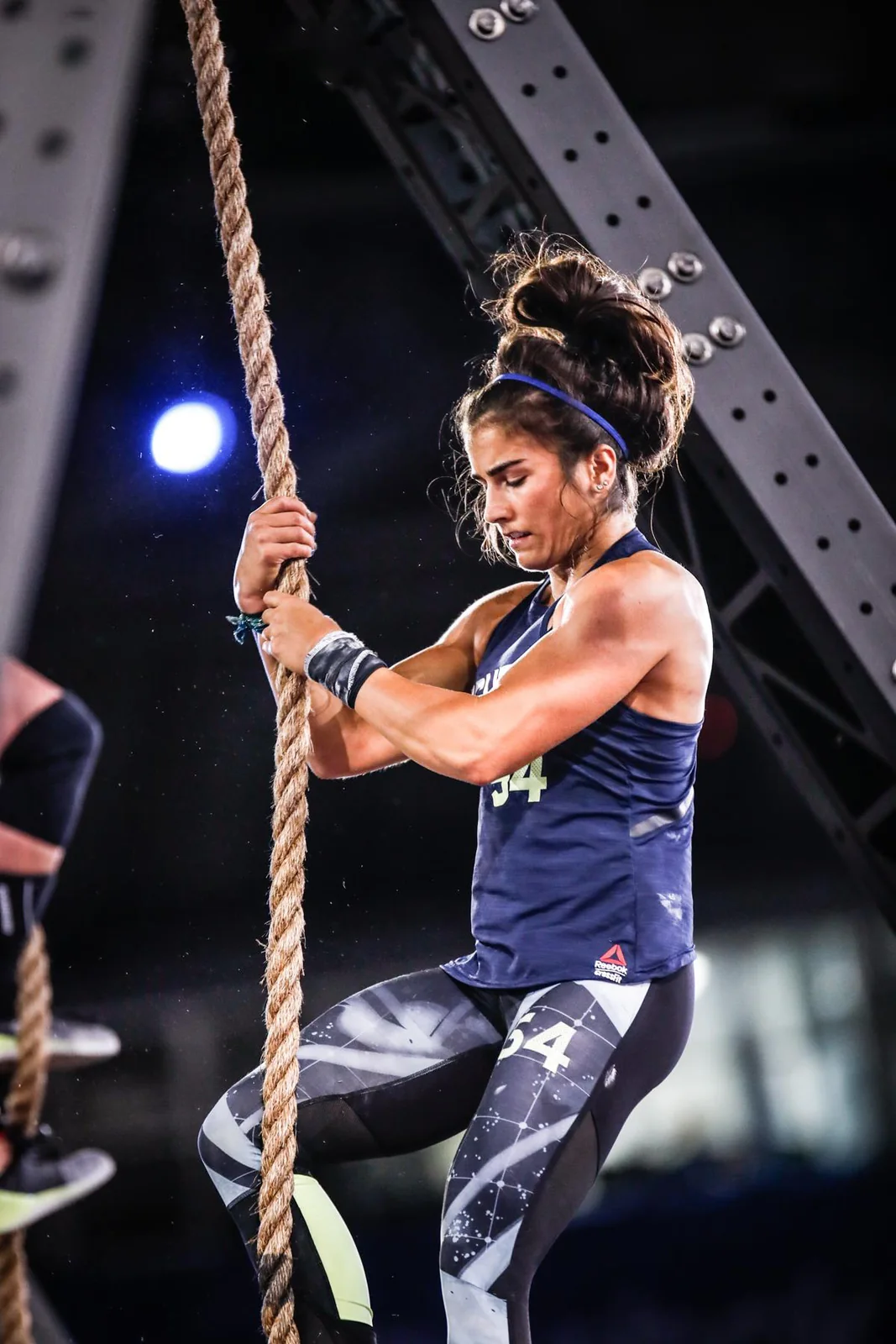
GrownStrong needed more than a fitness logo. It needed a brand that could speak to confidence, discipline, athletic grit, and feminine strength without becoming soft, generic, or overly decorative.
Deuxmont built a complete identity system around the tension at the center of the brand: strong and elegant, competitive and approachable, technical and human. The result was a visual language that could flex across apparel, digital content, merch drops, training material, and premium product applications.

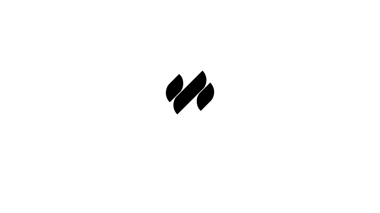
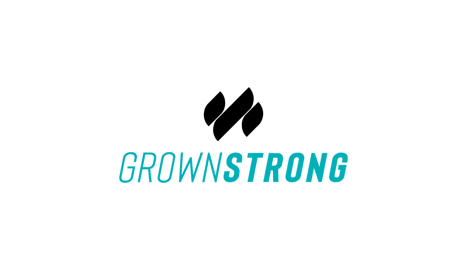
The icon was intentionally crafted as three strands: a bold vertical form for strength, a plant-like gesture for growth, and an abstract S/G relationship that gives the mark its own internal story. The wave-like rhythm keeps the identity athletic, elegant, and distinctly women-centered.
The logotype leans into speed and movement. Its condensed italic form gives GrownStrong a performance edge while keeping the system clean enough for apparel, product, digital, and event environments.
For campaign, web, merch, and hero brand moments.
Designed to hold on apparel, avatar use, product hits, and small-scale applications.
Condensed, italic, high-movement typography for a performance-first voice.
#000000#FFFFFF#00B0B9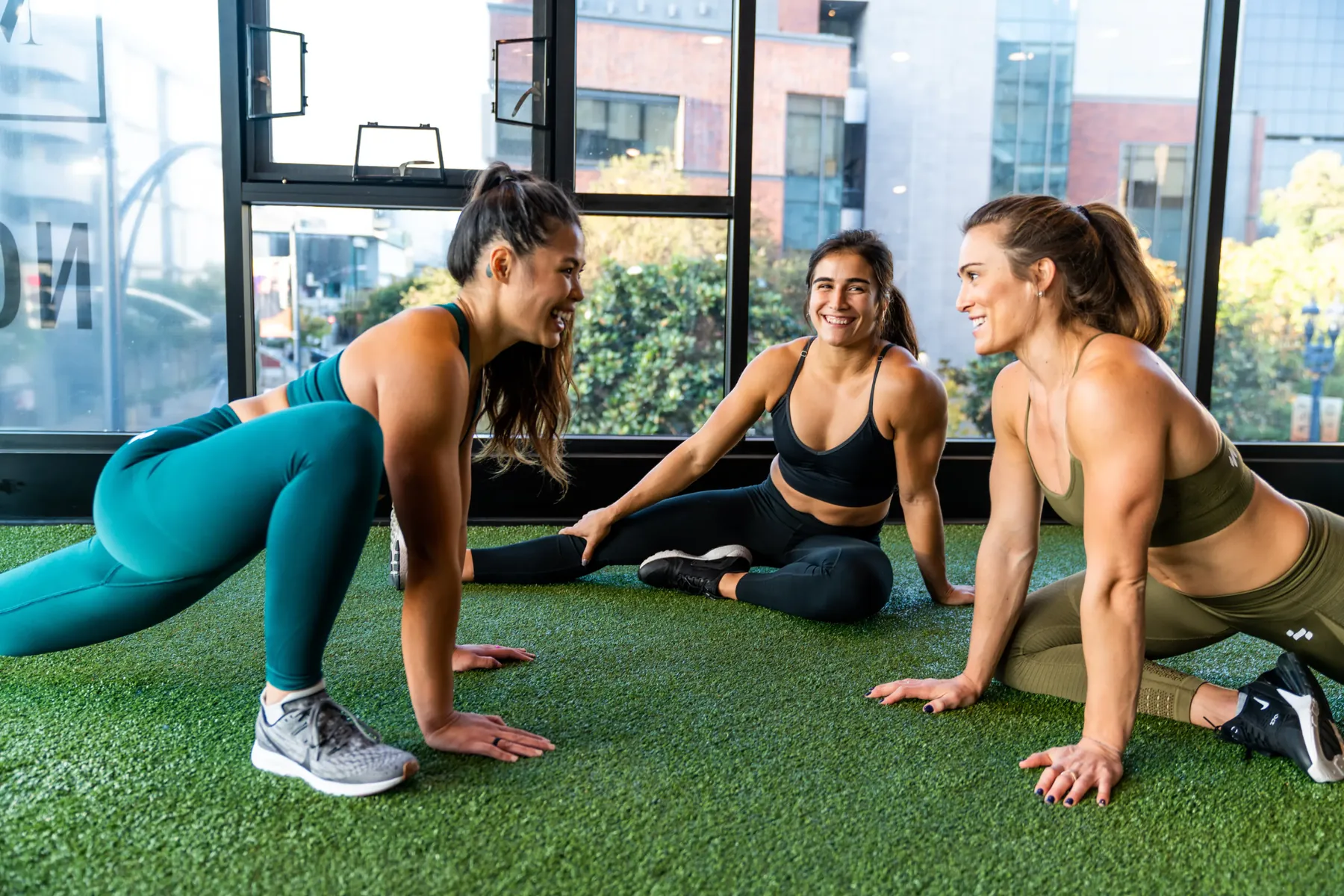
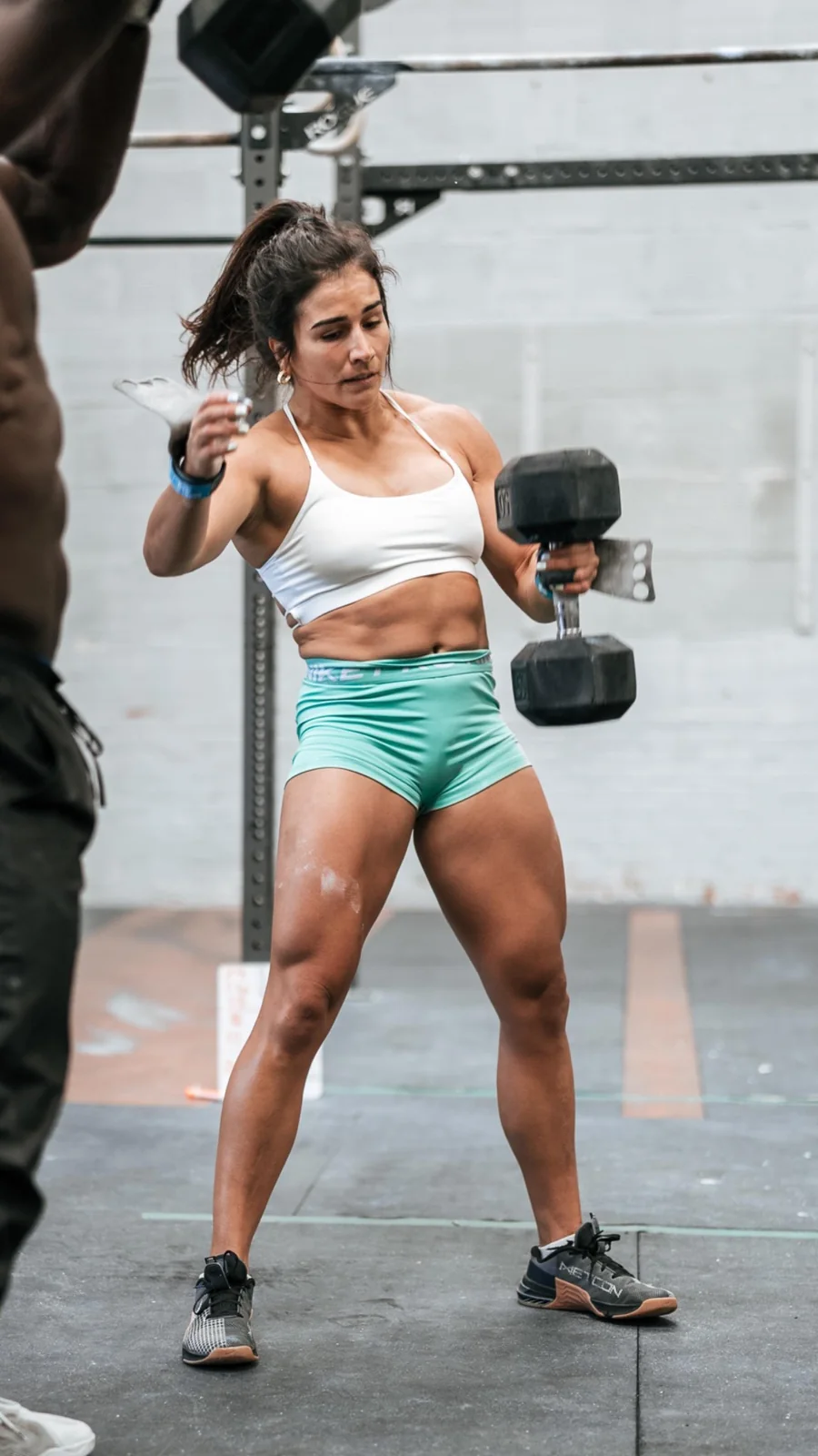
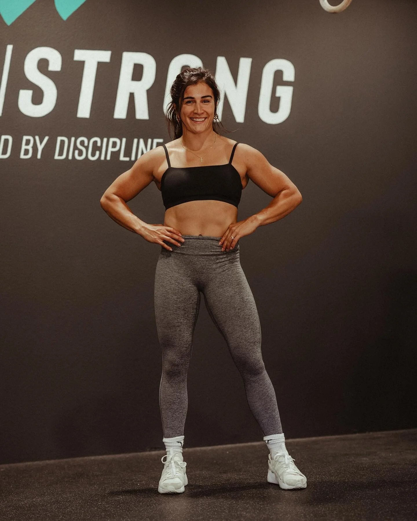
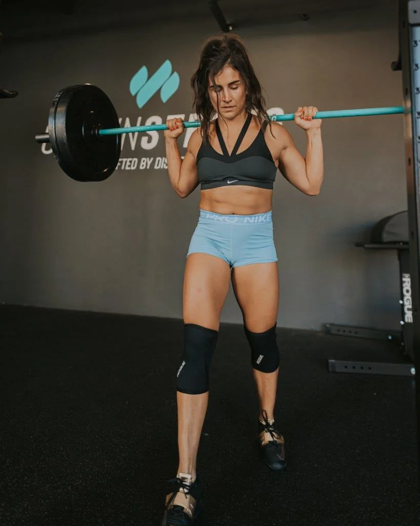
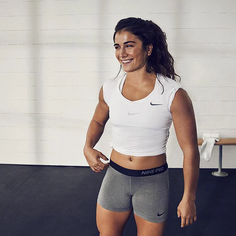
Because the brand lived in motion, every design decision had to survive real use: sweat, compression fabric, social crops, event photography, small-scale logos, and product detail moments.
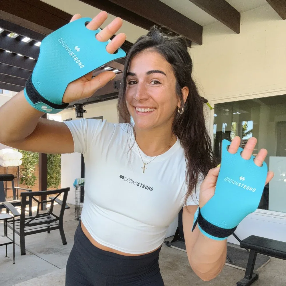
The system extended from apparel and Nike product contexts into branded training accessories, giving GrownStrong a consistent presence from online touchpoints to the equipment athletes actually use.
That range is what made the identity feel legitimate: premium enough for established athletic product, simple enough for merch, and unmistakable at a glance.
Defined the identity direction around confidence, growth, elegance, athleticism, and women-centered strength.
Built the three-strand icon, athletic logotype, lockups, spacing rules, variants, and usage standards.
Extended the system into wearable brand moments, performance apparel, product hits, and clean merch layouts.
Created a visual language that could scale across web, social, campaign graphics, and athlete-led content.
Matched the brand system with competition imagery, training culture, and premium athletic product context.
GrownStrong became a brand system with enough discipline for performance and enough emotion to build community.
Start a Project